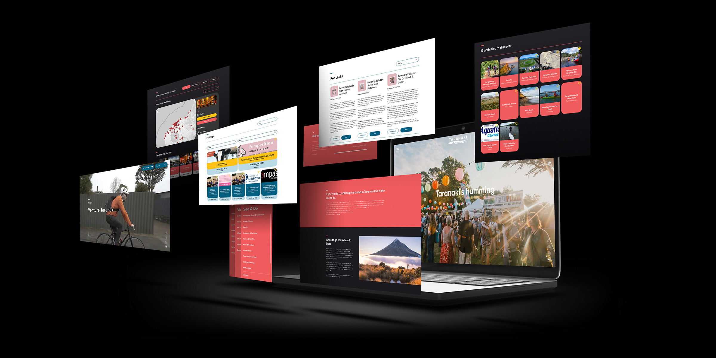
Venture Taranaki
Regional Economic Development agency; Venture Taranaki came to us to improve the usability and simplify their existing website.

Their website was comprised of a combination of sub-sites, and was structured in a complex way that found users and employees struggling to find information. The website had approximately 6000+ pages of content, and a total of 6 sub-sites which spanned across the two brands; Venture Taranaki and “Taranaki Like No Other”.
Management of information, including duplications of content and having to remember where to look for things, alongside not having the facility to automate some regular tasks were key issues from the administration side. From a user experience side, the data was hard to find and presented in a structure that doesn’t work for today’s audience and didn’t translate well on mobile.
The new website needed to be engaging, easy to use and maintain. Further cost-saving benefits were accomplished by having the conversations about day-to-day activities and the impact they had on the wider organisation. This is often overlooked when developing a website of this size. Done well, this can bring even more benefits to the organisation, which in this case we achieved.


